
My two magazines are quite similar to those of which are real media products. I had to do a lot of research into different types of magazines so that i could get a good idea of what they are meant to be like and
what interests the reader to picking up a magazine. I got influence off of magazines like NME, Kerrang, Q.
We had two main tasks set. One was to create a school magazine and the other was a music magazine. The tools that we had to use were Adobe Photoshop and InDesign.
Music Magazine Title

I got my inspiration for the name Replay from the fact that it is a musical term that means to play something again. It is very effective as it is a well known term in the music industry which many people can relate to. It has a simple color theme which goes with the rest of the magazine. Also the faded color is something very different to what main stream magazines use as they use blocks of colors for their titles. I felt that this way I would add my own personal touch to it.
School Magazine Title

This is the title for my school magazine. It is very simple and it basically is what it says. Its the weekly newsletter for Wilmington Grammar. The two colors i have used are the schools main colors. I have used them so people can relate to the title even better as they will immediately know that it is a magazine for Wilmington just due to the colors being used.
Mise En Scene is used in everything that we have taken pictures of. They can be the setting, props, lighting and even the camera angles being used. Heres some examples.

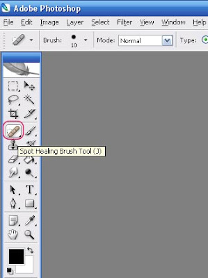
This is the main image i have used for my magazine front cover of Replay. It is a plain picture but it is very effective as it is simple and not too flashy. The lighting is centered around the middle of the picture to make the most of the dark shirt he is wearing. The shirt was edited in Photoshop as it was a bit too light, so with the use of Brightness/Contrast, i made it darker to suit the style of the magazine more. I didn't use any props as i thought that there was no need for them, because it would have made the picture more complicated than it needed to be. Also the setting is very simple as it is just on a plain background with no extra additions to the image as i felt that if i did have a busy background and with all the extra editing and words that i would add to it, the front page would look very busy and this was not the effect i was aiming for. To get rid of any imperfections on his skin, i used the Spot Healing Tool, which got rid of any marks that i didn't want being in the picture. This gives the model that extra bit to reach that perfect look that most models are trying to reach. I also used the Smudge Tool, to try and smudge parts of his hair to try and make it better than it was in the original picture that i took. The tools that i have listed above i have used in both sets of front covers, but i mainly used them in the Music Magazine as at the time we did the School Magazine, i didn't have much of a knowledge about Photoshop, but as time went on, i started to learn more and more about it and was able to do more to the picture editing.
The picture of the school pupil is my background for my Preliminary task which was the school magazine, "Wilmo Weekly." This has more Mise En Scene than my previous picture for my Music Magazine. I felt that if i included more of the school in this one, people will be able to relate to it better as they have an idea of what school it is for and if readers who don't go the school pick it up and read it, they will be able to tell it is a School Magazine by looking at the setting. Also the costume used is of a school pupil, which adds to the effect that it is a school magazine. However i did not use someone in the regulation school uniform as i felt if i used a 6th form student, the older pupils will be able to relate to the magazine better.
Costumes and props can come under the same heading as Mise En Scene. I didn't use many costumes and props as i didn't really feel as if they were needed for the pictures and the style that i was going for. I was going for a very simple looking effect which shows how celebrities from my Music Magazine don't need to have all the jewelry and extras to make them look like musicians. The clothing that they were wearing were quite simple. In my music magazine. Jerry Lockett was just wearing a black shirt, this was meant to link in with the fact that the band he played for were called The Black Polos. In my school magazine, the model is wearing a simple suit which is what the 6th formers at the school are supposed to wear. I have also used a bright shirt and tie combination under a black jumper to show that most types of shirts and ties are accepted as it makes everyone different. It gives them a sense of authority in suits from the rest of the school, which they should have as they are the oldest and are legal to leave school so they can dress how they like as long as its smart attire.
The two people i have used are very similar to ones that have been used in other types of magazines. This way people can easily relate to a magazine as they see the picture. Jerry looks like a stereotypical musician in my eyes, thatis why i have used him and dressed him in the attire of what the rest of the musicians in the band the Black Polos are wearing. If i used someone young looking or even very old, then it would not go with the theme of the magazine,as it has to be realistic to what musicians are like nowadays. Also i have used Jake in my school magazine, i used him as he is a pupil at the school so it was easy to use him as he was already dressed the part, i just had to make him pose in different ways until i got the right image. Both people are quite young, which is what people really care about these days, they are not too young that people woudnt take them seriously and they arent too old that they know that they woudnt go to school or be involved in an up and coming music band.
The two titles that i have used are both effective in the way that they can easily let the reader know what type of magazine it is going to be. Replay is a word used in the music industry and this can show that it is a music magazine and Wilmo Weekly is related to the name of the school, Wilmington Grammar which is also very effective. The font that i have used is quite big so that it dominates the page on both covers and i have used two bright colours so that it stands out from the rest of the page. In Replay i have given ibt a slightly faded look to go with the rest of the magazine but in a bright blue color. This way it goes with the dark theme with the faded effect, but the bright blue makes it really stand out and show that it is a new magazine just because of the tone of color used. Wilmo Weekly contains blue and yellow which are the main school colors. This is very good to relate the magazine with the school easier than it would be to use to random colors on the front page which have nothing to do with the school.This font is also jaded as you can see the background picture used behind which i like alot and wanted to show off as much as possible, even through the title.
Most of the content i have written is generally made up as i have ued many famous names and that which i do not have the rights for. However i have also made up some names and isses in which the main headline is made up and the images are all of people that i know and have recieved permission from. For my main task in the double page spread, i made it all up as it had to be and i also had to make it as similar to a real article as possible so that people can believe that Jerry Lockett is a real musician. The content of Wilmo Weekly is mainly things to do with school. You can find interviews from students, teachers and even past students. This way the reader can get a good feel of what type of school it is and for potential students, they can see what the next 7 years of their life would consist of. Also content like what revision classes and what school trips are coming up are also involved so that the pupils can keep up with what their school has to offer. Sports results and days of exams are also included.
The genre of the magazine is a R'n'B one, it helps to display that it is that because of the types of artists that are going to be covered in the content. This way people would be able to tell what style of magazine it is just by picking it up and reading the main headlines. Also even the styles of the iages that are in the content of the magazine can suggest that it is that type of genre. It is eas to tell the type of magazine by just looking at what the images are like, i have used many images of that sort to emphasise the fact that it is a R'n'B magazine. This is similar to what other big magazines do, as they use the styles of musicians to suit the styles of the magazine, this way different kinds of people have differents types of magazines to read and enjoy. The school magazine only can be one type of genre, which is a school type of magazine. It would involve news fromt he school and about the school and interviews.
The layout of Replay is very common. It has very similar layouts to those of the other big named magazines. I have used that layout because it is the best way to lay it out and it is the most effective in what it does. The reader can get the best out of the magazine just by the way it is layout. You have the title page first, which is to set the scene and show off to everyone what the magazine it is about and show slight glimpes of what the content is about. Then you get the contents oage, which is there to help the reader to find things that interest them easily without having to flick through the whole magazine and get to the pages straight away. Also this is the best indicator for what the magazine has to offer because it has all of what the magazine contains, this could be known as the most important page, because it has everything that the magazine involves in one page. The you get the double page spread, which is what most people were looking forward to as it is the main headline on the front page and the main image on the front page is of the person involved in the double page spread. This page is used to give an insight of what one of thier favourite musicians is really like. You can get questions you wanted to know about answered and what they do in their day to day lives. the school magazine is of the same layout but it has less detail, because the music industry is alot bigger than that of Wilmington Grammar. The front cover includes one of the pupils that attends the school and aslo has some headlines of what goes on at the school and shows how the school can help. The contents page helps for the reader to find what pages they need to go to to find what they are looking for. This is very useful as it is easy and it is the main page of the magazine as it involves everything that is in the magazine.
No comments:
Post a Comment